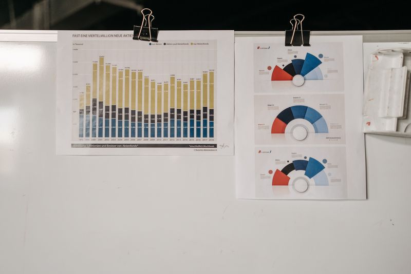
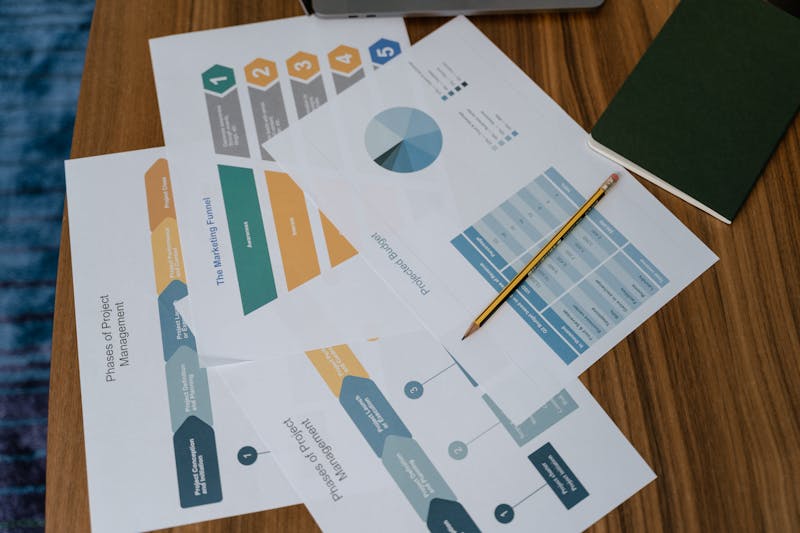
Area chart
An area chart shows how a quantity moves over time. Stacked areas are useful when you want to show how the parts add up to the total.
Most chart tools ask you to learn them first. Plotwell doesn't. Pick a layout, paste your numbers, and you have a finished chart or diagram in minutes — one that explains itself at a glance.
26 professional chart types, from stacked areas to Sankey flows
Designer-made templates that carry your report to the finish line
Data visualization without a training course or an admin seat
Publish, share or export print-resolution files in one click
Drop finished charts into decks, docs and reports without fuss
Drag-and-drop editing built for people who are not designers
Plotwell ships a library of free, designer-built templates. Drop your numbers in for instant results, and switch between bar, line and pie layouts later without rebuilding the data.
Our design team tuned every chart type so the defaults already read well. From there it is all yours: swap the palette, change the type, adjust the background, and drag pieces where you want them.
We don't stop at charts. Plotwell has templates for infographics, decks and reports, so your visuals land exactly where they need to. Publish however you like: share a link, download the file, embed the live chart, or order professional prints.

Read up on each chart type and find the right one for your project by browsing the categories below.
An area chart shows how a quantity moves over time. Stacked areas are useful when you want to show how the parts add up to the total.
A bar graph compares values across categories. Each bar stands for one category, and the taller the bar, the larger the number it holds.
A comparison chart sets options side by side. It works well for weighing products, plans or pricing tiers against each other.
A donut chart is a pie chart with the middle removed. The open center is handy for a headline number or a short label.
A pie chart splits a whole into its parts. It is the fastest way to show a handful of fractions or percentages at a glance.
A T-chart lines up two opposing views. Pros and cons, before and after, or two concepts you want readers to weigh together.
A table lays out data in rows and columns. It is the right pick when exact figures matter more than the shape of the trend.
A Venn diagram shows what two or more sets share. The overlap is where the sets have something in common.
A histogram is a bar chart for frequency. It shows how often values occur across a continuous range of measurements.
A pictogram counts with pictures. Repeated icons make ratings, survey results and progress readable in a single pass.
There is a template for every chart type, so you can spend your time on the data.
Plotwell lets the least design-confident person on my team — me — turn out clean social posts, charts and diagrams my clients take seriously.
Devin Ashworth
Marketing manager