By
Marta Quillbeck
On
4 October
Project name
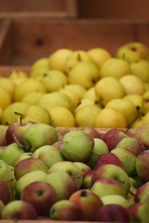
Remind the room what this project is and who it is for before a single image goes up.
For example: “Wickmoor Ltd. presses a small-batch cider in the Sedge Valley from fruit picked within four miles of the mill. The range sells in 330ml bottles and 20L bag-in-box. Volumes here are given in hectolitres. The house name is taken from the lane the orchard sits on.”
Write your own version, or lift a line from something already published — a listing, a back label, a stockist page. It only has to be true, and short enough to read aloud.
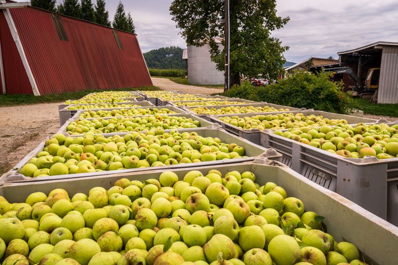
Say what the visual direction is, then say why you landed there. What made this palette right, instead of the one everyone expected?

1— One long sequence of images, no chapters.
2— Grouped into sections, with a divider first.
Section dividers follow this slide. Change them, cut them, reorder them — nothing in here is load-bearing.
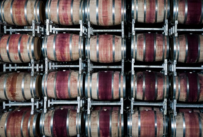
For headlines we want a wide grotesque that still holds at poster size — something you would read off the side of a crate. Halgate Grotesk 62 is a close match for the numerals.