
Packaging
Eight tubs, one grid: the quiet math behind a dairy aisle takeover
A regional creamery hired a two-person studio, dropped the photography, and let a single condensed cut carry the whole line.
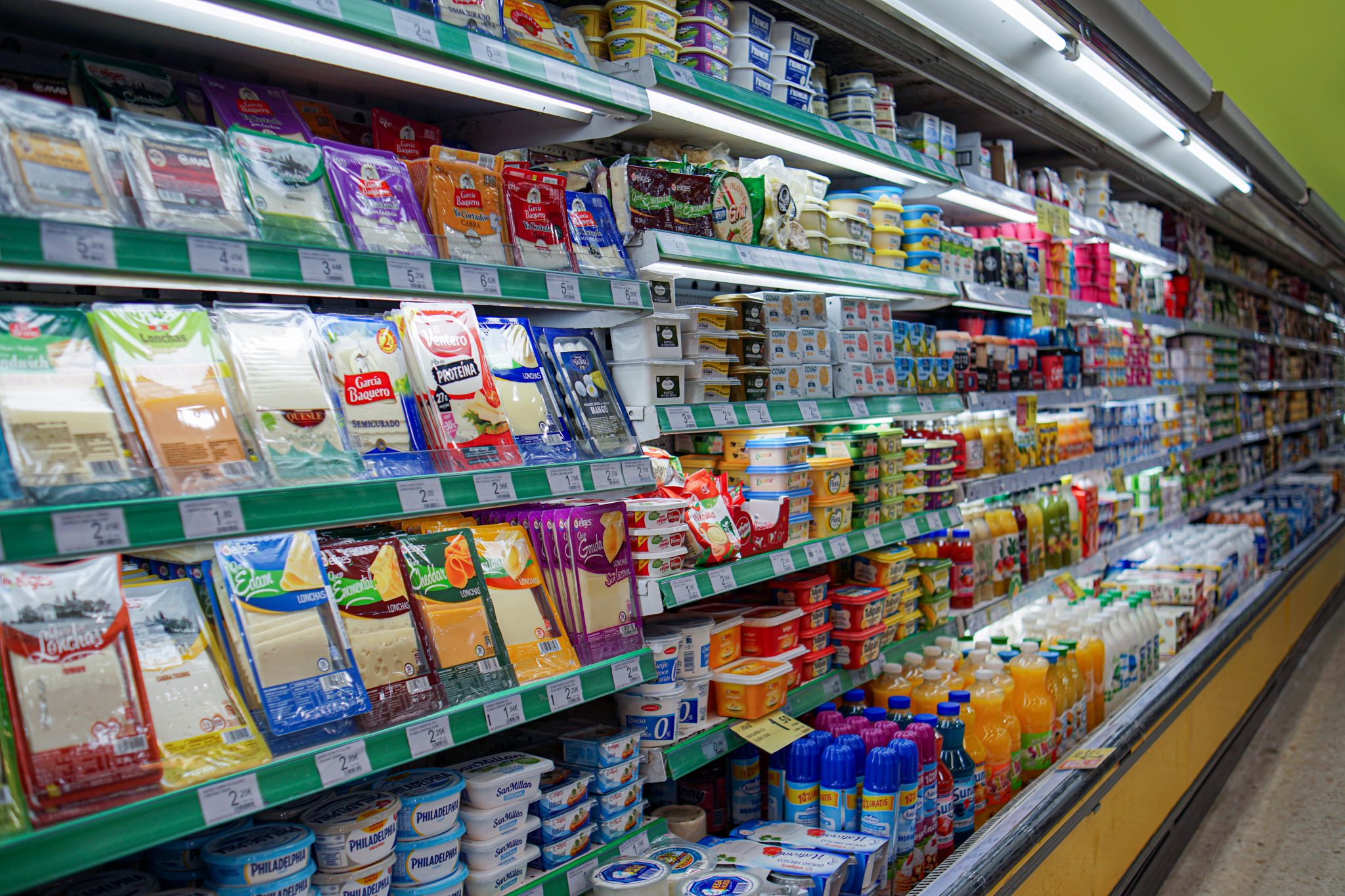
Issue 214 — The Shelf Life Issue. How the supermarket aisle became the last great proving ground for type, color, and nerve.
Photograph — Studio HalversenA regional creamery hired a two-person studio, dropped the photography, and let a single condensed cut carry the whole line.

Cut for a 1931 seed catalogue, forgotten for sixty years, digitized on a dare — and now shipping in 47 weights.

Ink density, stock behavior, the four-hour drive to press check. Three veterans on the craft that survived the software.

Everything else about a product can be edited after the fact — the site, the ad, the founder's story. The label ships. We spent four months with the designers who treat that permanence as the point, and found an argument about trust hiding inside a 198-gram tub.
Read the storyA weekly column on the objects designers argue about — this month, the return of the die-cut mailer.
Six working designers take apart one recent identity, on the record, with the receipts.
Our annual open call for designers under thirty-five. This year's shortlist runs to 62 studios.
One book, one long conversation, one member call a month. Currently on the table: colour theory after Albers.
Studio and in-house roles, salary bands published or the listing does not run.

"A shelf is a spread. You get one glance, and the reader is holding a basket."

"Revivals are arguments about the past. Most of them are badly worded."

"Press checks taught me more about hierarchy than any grid ever did."
Offset arrives four times a year in print and every Tuesday in your inbox. Members get the archive back to 1943, the Reading Room calls, and early entry to New Work.
£68 a year · 3,412 members · cancel any time.