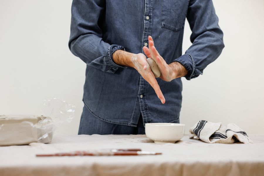
Calder Scholars
Rafael Ortega and team design the visual identity for a travelling scholarship that sends craft students across six regions during their bridging year.
Visual identity for a travelling scholarship that sends craft students across six regions during their bridging year.
Design system and retail brand architecture that honours the collection’s heritage while enabling the creation of distinctive, small-run objects.
Industrial design of a species-listening device that makes following wildlife in your garden simple, engaging and quiet.
Visual identity for a new initiative that organises large, mainstream events to shift culture and public discourse on housing.
Industrial design of a child-friendly voice messaging device for ages five to thirteen.
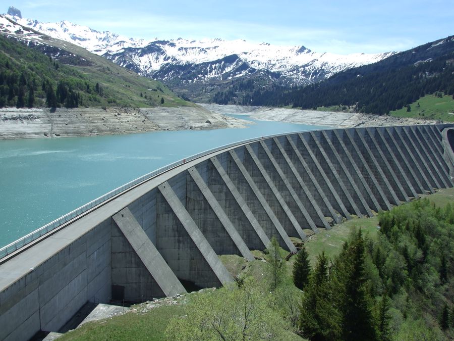
Brand identity for the hydro operator setting new standards in scale, resilience and continuity of supply.
Brand identity for an award-winning technology replacing plastics with eco-friendly, plant-based alternatives.
A new visual identity framework highlights the school’s unique culture of invention and collaboration across disciplines.
Sweeping change rarely means discarding everything. A company’s own history is usually the steadiest ground for imagining what comes next — look closely enough and the clues to what makes a brand particular are already there. The goal is never a timid, incremental compromise. It is a confident consolidation of what an organisation has always been.
A brand identity refresh for one of the country’s leading toy makers highlights…

A vibrant, contemporary and reimagined visual identity for the nation’s art museum.
A new brand identity for the iconic city store.
Brand identity for a payments network emphasising clarity, reach and trust.
Identity, titles and graphics for the award-winning drama series.
A brand identity refresh for one of the country’s leading toy makers highlights…
“Good design is really storytelling. It builds a narrative that people can meet on more than one level.”
Odile Marchand
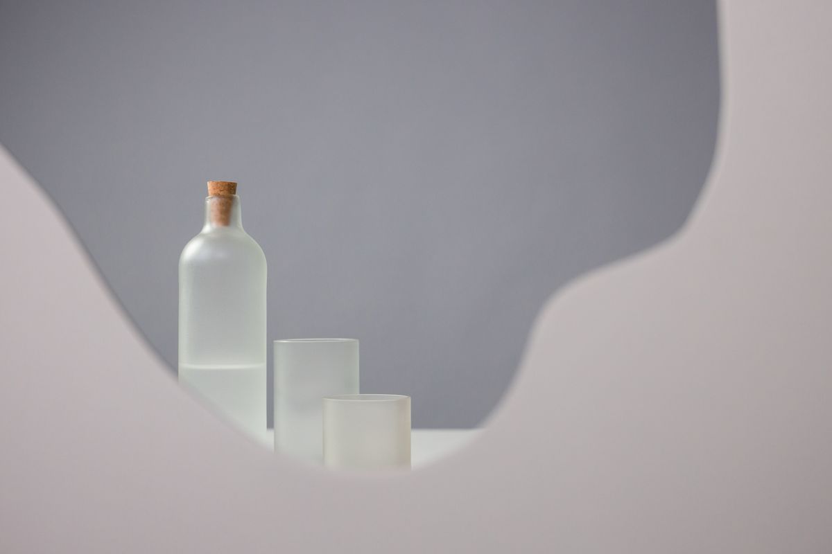
Brand identity and packaging for the coastal skincare house merging fermentation science with daily ritual.
Design and production development for the Marchmont Institute awards.
Documentary film by Ines Calloway visiting the workshops that press the Foxglove field kit.

Industrial design of an unhurried new device for brewing spiced tea at home.
Brand identity and packaging for an advanced materials house that offers air-purifying paint and other products supporting quieter interiors.
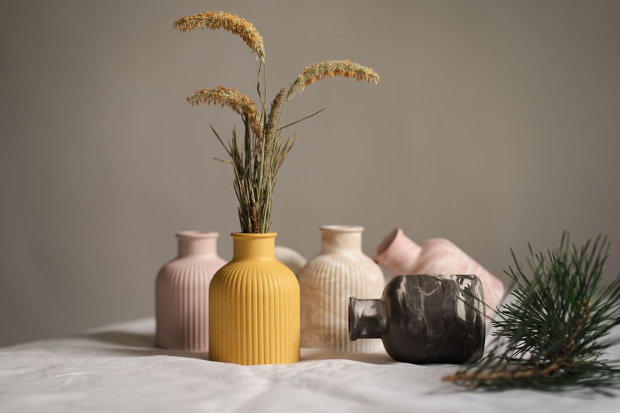
Industrial design of a range of refillable containers for a personal care range.
A range of fragrances launching the Obliq beauty house.
A collaboration between Alder & Ash, Cass Studio and Thornfield Textiles that sets out to reinvent the humble tote bag.
In 1961 the impresario Joan Petrie began a summer tradition of staging free outdoor performances by the harbour, inaugurating the Riverside Season. Alder & Ash partner Ines Calloway, whose relationship with the theatre spans four decades, has designed a new identity for the series for twenty-eight consecutive summers. Each campaign is cut to the season’s theme, building a highly visible graphic vocabulary for outdoor advertising and on-site signage.
“The studio works much like a co-operative. We keep shaping the culture, the work and the spirit of the place together.”
Rafael Ortega
A data-driven visual identity and graphics programme for the 24th international exhibition of the influential design triennial.
Data-driven visual language for Adaeze Nnamdi’s moonshot attempt on the four-minute mile.
An interactive storytelling experience and timeline illustrate the charitable trust’s impact on maternal health since 2001.
An interactive digital platform for the leading chronic disease research organisation.
Personalised data portraits prompted reflection and conversation among 340 delegates.
An interactive timeline and campaign celebrates the Tidal Art Foundation’s 40th birthday.
A new campaign calling for global financial reform.
Brand identity for the radical new patient-centred healthcare organisation.
Alder & Ash has been part of the Bristol design scene for over half a century. Its founding partners came of age in the postwar city, and the first shape of the studio was very much a product of the harbour’s workshops. Today the evidence sits all over the city — in logos, brand identities, signage systems and campaigns — a reflection of the symbiotic relationship that informs so many creative enterprises here.
A story-driven identity for one of the country’s best-known theatres.
Identity, campaign and graphics system for the regional fashion council.
Identity for the largest collection of living plants in the region.
Identity, website and packaging for a much-loved harbour hotel.
Identity and signage for the country’s largest municipal park network.
A story-driven identity for one of the country’s best-known theatres.
“No two projects are the same, and no institution works like another. It is always a fresh journey toward the truest form of expression.”
Harry Pell
Identity and opening title sequence for the comedy drama series co-written by and starring Ines Calloway.
Identity and title sequences for the docuseries about the Harbourside marching band.
Visual identity and website for a pioneering company that helps machines understand video the way people do.
A new identity and opening title sequence celebrate a landmark season for the long-running sketch show.
Graphics and film for the academy’s major exhibition on the birth of coastal modernism.
Brand identity for the film production company.
Social campaign for the lantern month, connecting moments of collective celebration and individual contemplation.
Title animations and graphics for the award-nominated comedy series.
The Harvest Light Festival has been an annual celebration of making for more than twenty years. Since 2014, Alder & Ash partner Naomi Adeyemi has served as the festival’s creative director, responsible each September for a new visual identity. By remixing a few fixed elements — one typeface, a signature red and a simple monogram — the programme unifies several hundred events while reaffirming the region’s standing as a place that still makes things.
“Design is not only problem solving. Most of the work is asking a better question first.”
Naomi Adeyemi
Visual identity for the sixth edition of the region’s open-workshop festival.
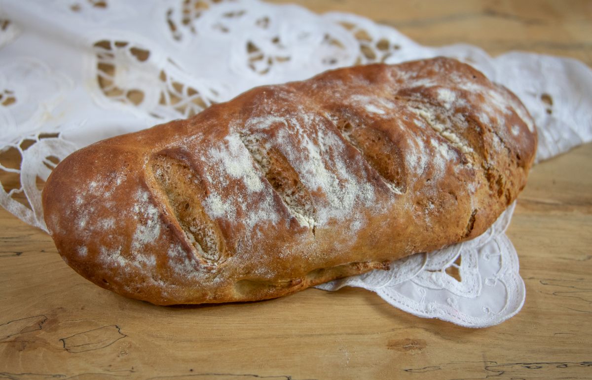
Brand identity and environmental graphics for the harbourside, family-run trattoria.
Exhibition graphics for a showstopping new immersive show celebrating the jeweller’s archive.
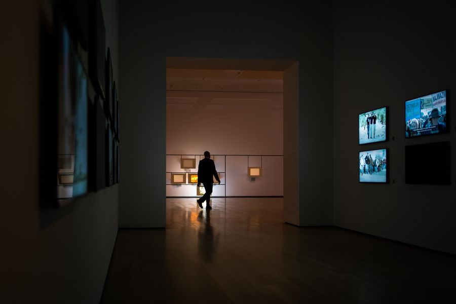
A vibrant new series of prints by Piet Vandermeer making its debut at the 2026 Harvest Light Festival.
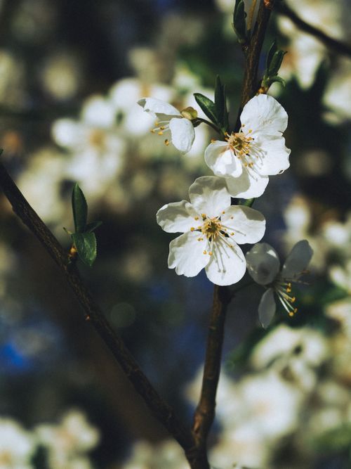
Visual identity and naming for the city’s ambitious new science and innovation district.
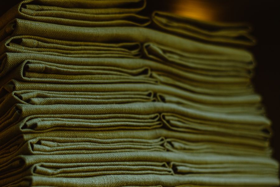
Celebrating the ongoing collaboration between Ives Kilmartin, Harry Pell and the Thornfield fabric design team.
Identity, environmental graphics and a custom typeface for the neighbourhood osteria.
A cinematic new identity for the region’s annual festival of making.
Rafael Ortega and team design the visual identity for a travelling scholarship that sends craft students across six regions during their bridging year.
Odile Marchand and team create a design system and retail brand architecture that honours the collection’s heritage while enabling distinctive, small-run objects.
Alder & Ash is an independent design collective where 18 partners work alone and together to shape what gets made next. Guided by curiosity and a stubborn interest in craft, we build work that reframes ideas, shifts perception, and leaves a mark across disciplines and industries.